Thursday, 27 May 2010

OUGD103

This image was created for McCann Erickson Madrid/Junta de Andalucia and their andalusian extra virgin olive oil. Project tagline: 'The healthiest oil for your engine.'
Its promoting their product, extra virgin olive oil, trying to show a healthy heart. Its image only based and without the slogan i wouldn't know what it was trying to promote. I don't think its exactly appropriate for everyone. I don't think it could be used as a TV commercial as its quite in your face and out there to be just promoting olive oil.

OUGD103

Arsthanea teamed up with The Mushroom Company to create set of images for Cosentino and one of their brands - Eco. Run as 2009/2010 campaign. Eco produces hi-quality kitchen worktops made from recycling. Layout design and photography by Ipsum Planet.
The function of these images is to show the company as clean and 'hi-quality' and the images perceive perfection. Its potential audience is probably more wealthy people as the products being recycled would make the products more expensive. I would of thought these would be found in places where the product would be sold, perhaps it can only be brought online so it would advertised on a website. This is very high end, expensive work and for a high end product.


This image not only shows the company Eco but it also subtly includes the recycle logo.


I really like these images as they are original and not like anything i've seen before. I think the photography is amazing too.


These three images include type with the information and the logo on them. It uses simple text and doesn't include too much information which stays in keeping with the images.


In comparison i think the images on their own are just as affective as the image with type. I personally prefer the images on the own as their so clever and intriguing although i wouldn't know what they were trying to promote.


OUGD103

These images are used to promote vitamin water. It uses images of people playing sport, basketball etc. Its colourful and kind of graffiti like, so it seems as if its aimed at younger people, promoting vitamin water so help you in sports. I think this work is completely appropriate for its audience. It is distributed through http://www.your-majesty.com/#/work/archive/vieraweb and can also be found on facebook http://www.facebook.com/vitaminwater?v=app_352976184252.
They are all images only which i think works really well as the images get the message accross without a need of type.


Tuesday, 25 May 2010

OUGD103-Speaking from experience

I found this image in 'Masters of poster design" and thought it would help me a lot with the style, layout and colours i wanted to use for my comic book.

OUGD103-Speaking from experience

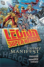
I found this website http://www.dccomics.com/dcu/comics/?cm=14792 which gave me an idea of different layouts and covers.


OUGD103-Speaking from experience

I found this website http://www.your-majesty.com/#/work/selected/cisco_comic where they have different comics and a video on how they put bits together. I like it because its clean cut and very relevent to the project i am doing.


OUGD103-Speaking from experience

Pop art Roy Lichtenstein
I think Pop art and Roy Litchenstein's work is relevent to my work as i have tried to my
photographs is his style.